Patterns over words
Some of my favorite charts that really hammer in a point
Welcome to data + feelings, a newsletter about being human and being data.
I was drawn to data visualization because I was curious, and the medium answered my questions. I have always been fascinated by diagrams, those carefully curated and labeled sketches. I was originally focused on interactive visualizations, “explorable explanations” as coined by Bret Victor, because I felt like I understood something by playing and doing. Experimentation was how I fully grasped a concept.
I then quickly came to appreciate the power of static charts for their elegance and accessibility. I love ornate, beautiful visualizations of information but I am always looking for the bigger picture: the pattern in the chaos.
This week I shared some thoughts on data visualization as part of a larger presentation on visual journalism at The 19th. I wrote out a list of questions I ask myself when evaluating whether to incorporate data visualization into a story.
Does the visual do something only an image can, like highlighting a pattern?
I love my complex charts full of annotations and advanced graphic techniques. But some of my favorite work is simple and to the point. Here are a few of my favorite charts I’ve made that call out patterns.
How the Latinx vote changed in 2020
This trio of scatter plots clearly shows how heavily-Latinx counties swung right during the 2020 presidential election.
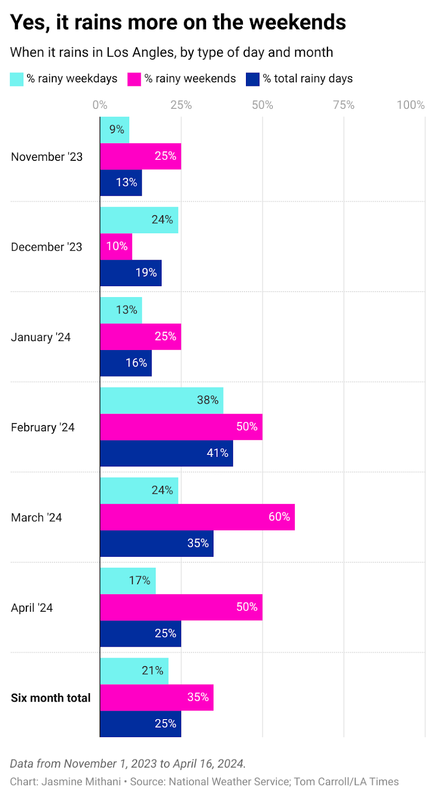
Yes, it rains more on the weekends
If you live in Los Angeles, you know we’ve had a strange weather phenomenon the past few months: a week of clear skies only to darken on Friday evenings and storm throughout the weekend. Then inexplicably, the sun shines again once we all have to go to work on Monday.
It’s been a local running joke but Tom Carroll of the LA Times 404 team went through six months of weather reports. He concluded that 40 percent of the rain we experienced over the past few months was during the weekends. But as he notes in the video we have fewer weekends than weekdays, so I made this chart to show the skewed rain distribution.
Country music airwaves are dominated by men
This is a chart about gender I could make over and over again, across topics and industries (including the federal judiciary). Every time it highlights the overwhelming gender disparity in a way that really hits you over the head.
Do you have a favorite chart that makes a point clearly and cleverly? Let me know in a reply or the comments!
⚡️Quick hits
The future of Knock LA, an essential news source for my city, remains dire as reporters advocating for independent reporting have been ousted. Sign this petition to show your support for local news.
LA Taco has made immense progress towards their goal of 5,000 subscribers over the past week but they are still short at least a thousand. Subscribe today to support local news, plus get some sweet membership perks.
I wrote about how data brokers facilitate the doxxing and harassment of reproductive health workers
I had some questions about whether to use Latinx or Latine when describing the community and this Teen Vogue article by Tess Garcia informed my thinking (which is ever evolving, please feel free to chime in!)
Maybe one day I’ll write about how my interest in data visualization actually started with video games
I have struggled to succinctly summarize my newsletter but “being human and being data” has been stuck in my mind for a bit
It’s always a good time to revisit this piece on visualizing flawed data by Kae Petrin at Chalkbeat
This podcast episode about how climate is a reproductive justice issue with my colleagues Jessica Kutz and Errin Haines sounds soooo good
Some of my annual resolutions are going better than others, I think I’ll write a newsletter check-in soon
I hope everyone is staying safe this week.
💜 Jasmine


This chart on the productivity-pay gap is an all-timer: https://www.epi.org/productivity-pay-gap/